Week 9 – Curating an Exhibition

I had the opportunity to curate the hanging of the exhibition of the East Sutherland Camera Club (ESCC) at the Grace of Dornoch Café and Deli.  The photo collection was comprised of the regular contest winners in the three categories of colour, monochrome, and creative (altered reality), along with the club’s selected entries for the Highland Challenge, an annual interclub competition among a half dozen or so camera clubs in the Highland’s.

While in the past ESCC has only shown their work in the Brora Library during the month of August, the committee (of which I am part) was convinced to exhibit in other communities to promote the club and showcase the excellent work of local photographers.  As I had done an exhibition of my own work last August at the Grace Café I was able to secure the space again this year for the ESCC show.  In the past, the exhibition was always hung in the 4 categories in conventionally oriented fashion without necessarily considered visual or topical continuity. For the Grace exhibit I was given free rein to organise the show as I saw fit, so I chose to group the work differently and to arrange it with an eye to visual continuities and transitions.

untitled-112119

At the extreme right are a group of portraits.  At the center is a puffin, while surrounding are 4 portraits of people arranged such that their gaze is directed a the puffin.  To the left of that grouping are the landscapes with the upper row arranged such that there is a gradual transition through the colour palette and the horizons are roughly aligned.  The lower row is slightly more eclectic mix of photos in the landscape category that include colour, monochrome and some altered reality photos.

untitled-100546

One next wall to the left are a grouping that are based around a theme of circular forms and next that grouping another of more linear geometric forms.

The two photos that did not fit into any of these other groupings, an owl and a highly manipulated image of a boy gazing at the sea each got their own space on a smaller section of wall.


untitled-112014

I am pleased to say the exhibit was generating a good bit of interest and discussion among café customers on the opening day and hopefully will continue to generate footfall as the word of mouth and the social media advertising take hold.

I believe these opportunities to think critically about how work should be exhibited and viewed to develop a hang plan as well as the logistics involved with securing locations, planning the use of space and the actual logistics and process of getting work on the wall are valuable bits of education and experience that will continue to serve me well in future.


Week 8 – Tutorial with Dr. Steph Cosgrove

In preparation for this tutorial I out together a PP as a prompt for some of the items I wanted to discuss and about which I had been ruminating as I work to resolve the specific direction of my FMP.  The pdf can be found at the hyperlink that follows.

The conversation with Steph was helpful and she thought the Beyond the Noise approach was very viable.  We discussed the concept for presentation and the attendant soundtrack and the idea of using the natural sounds of Coul Links as the background for the projected display.  I would also include “people noise” as background for the archival material,

Steph suggested I look at “Shores of an Island” by Breure and van Hulzen, Vivianne Sassen’s installation at TPG, Zed Nelson’s “Gun Nation”, Nicola Dove’s “Observance” and Richard Misrach’s “Desert”.  Shores of an Island and Observance both incorporate sound with subtly changing video scenes.  Sassen’s installation was a multimedia presentation.  Nelson’s work looked at a topic and then revisited the same people 20 years later, recording interviews and recreating the original photographs taken those many years ago. Misrach’s Desert is among the series of projects he did which are all studies of place.

While none precisely correspond to my project they each include elements from which I can learn.

Project Ideas rev 1_30 Jul

FMP Week 7 – Zine Project

I have spent the week producing a publication for the Dornoch Cathedral about the stained glass windows.  The windows are an item of special interest for many of the visitors to the Cathedral.  The docents and welcome table have been using a loose leaf binder with poor quality photographs to provide information on the widows to visitors.  We decided that it was likely that some number of visitors would be willing to buy an affordably priced guide from which the proceeds would benefit the Cathedral maintenance fund.

I produced a 32 page magazine sized publication that included photographs and descriptions about each of the 25 windows.

untitled-1000172

I was well pleased with the outcome despite the relatively short time that was available to design and produce the zine.  I had the advantage of having access to prior research on the historical aspects of the windows and a library of photographs I had taken previously, some of which I had used in a prior publication..  Key drivers for this publication where cost, portability and legibility, with accompanying photographs that were of sufficient resolution for visitors to want to purchase as a memento of their visit to the Dornoch Cathedral.

As the principal driver, production costs had to be low enough to be able to reach a price point that was attractive for visitors while still allowing a reasonable profit margin to benefit the Cathedral Maintenance Fund.  This dictated a Zine format as opposed to a photobook or trade book.  This allowed for good quality coated paper that was bright, had a good feel, and reproduced the photographs to a reasonably high standard. Page count was another factor, and I had to manage the design, layout, and amount of text in order to stay within an affordable page count.

Portability was also key as the Cathedral is typically just one stop among many in the typical visitor’s Highland itinerary.  An inflexible, heavy book (aside from the attendant cost) would cause most to balk at a purchase.  On the other hand, something light and even foldable would make it easy to pop into a purse or rucksack.

Legibility was the key criteria in choice of font style and size as well as the glossy coated paper.  It is often not exceptionally bright in building and having font of sufficient size and sans serif on bright paper makes it far easier to read as visitors walk about the Cathedral looking at the windows.

Lastly, photographic quality at a standard that reproduced well enough that visitors would consider having the publication as a keepsake was an important consideration.  This again factored into the paper choice for how the photos reproduced, but the capture and post-processing of the images was equally important.  Stained glass is notoriously difficult to photograph well and the dynamic range and colour palettes are widely varied from window to window and often within individual windows.  Particular attention had to be paid to when to photograph to prevent excessive highlights as well as excessive underexposure.  Typically, exposure bracketing is employed, but I did all of these windows with single exposures by working primarily on cloudy days and with the interior lights off.

The production of a Zine was good practice in designing and producing another publication. It made me think very specifically about the intended audience, the practicalities of publication, and the requirements of the customer in order to strike the correct balance among the competing factors. It also required editing, and in some cases, rewriting text from the source material I obtained from those who did the original research in order to stay within the design layout and page count. All of this is excellent experience and I learn more with every publication.

I have yet to determine whether I will produce a publication in conjunction with my exhibition or whether I will wait until the decision on the future of Coul Links is taken.

FMP Week 6 – Proposal feedback

I had my proposal feedback session with my tutor.  Some of the key points included:

  1. Thorough and detailed
  2. Showed excellent scholarship and communication
  3. Felt that I may be hedging my bets too much and that I need to adopt a clear stance
  4. Title is not strong enough yet
  5. Noted the significance of the Liz Wells quote – “… our relation to the environment in which find ourselves, and of which we form a part, is multiply constituted: the real, the imaginary, the symbolic, memory and experience, form a complex tapestry at the heart of our response to our environment, and, by extension, to landscape imagery.” (2011: 2)


The questions and suggestions that followed included:

How, why and if people are in this story then how can they be contextualised. E.g. how have people used and abused; political conflict, etc.?

It was suggested that I revisit Feldman’s 9-11 work and Mathieu Asselin’s Monsanto

It was also suggested that I research news clippings  and consider rephotographing those and the history of the development proposal.

WELLS, Liz. 2011. Land Matters: Landscape Photography, Culture and Identity. London; New York: I.B. Tauris.

FMP Week 5 – Reflections and Progress

As I await the feedback on my proposal, I am continuing to explore narrative approaches to the project.  Recent political events have, in my mind, cast further doubt on the likelihood that development will be approved and that alters the calculus on a major element of the originally envisioned project.  On the other hand, underlying the subtle and not so subtle aspects of the controversy, most of which are not visible, lies the place, Coul Links, which goes on oblivious to the attempts to alter or preserve it.

So, I find myself asking; is the controversy about the potential development even important at this point or is it just noise hovering around the periphery of a more enduring story?  Or conversely; is the place only significant and on my radar because of the controversy of the potential development?  Would anyone notice or care truly about Coul Links had someone not proposed building a golf course there?  After all it has been a designated site for a quarter century, and no one really seemed to care that that the site was not being maintained as it was meant to be.  It is perhaps only because of the proposed development that anyone aside from local residents are even aware of the environmental designations assigned to the site.

And here is the crux of the issue with regard to FMP; which perspective to adopt and which chapter of the story to tell. I have begun the process of looking through all of my contact sheets and archives of the work done on the course and I have also started researching the print and on-line sources that addressed the Coul Links development. I can see potential narratives from several perspectives and yet I haven’t enough clarity or conviction to settle on one just yet.

I think perhaps the process of choosing photographs may help a narrative emerge.  Additionally, the archival research from the news coverage over the past 3 years will also support the narrative.  Time to get on with it.

FMP Research – Week 4

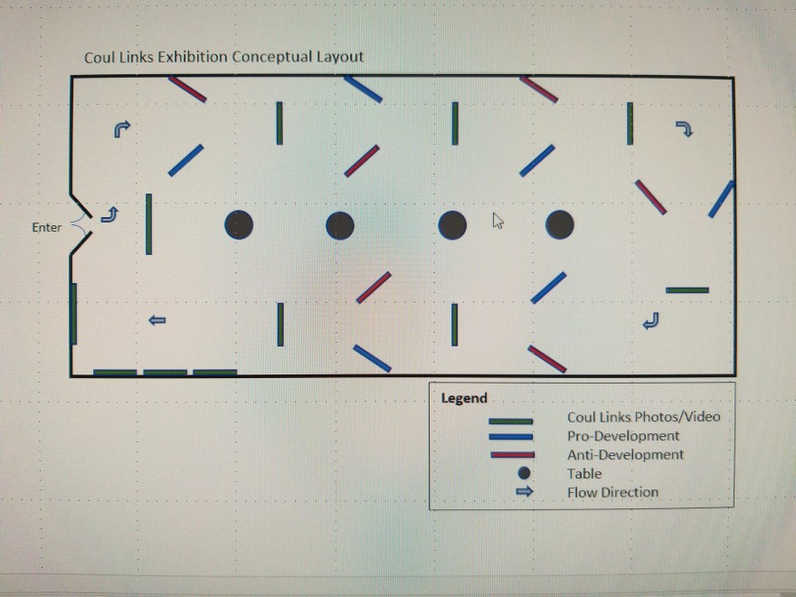
I travelled to the Netherlands and Belgium to visit museums and galleries in Rotterdam and Antwerp to further research how work was being exhibited and how those techniques might be applied to my work for FMP.  I also looked at many photobooks and had the benefit of the principal exhibition in the Fotomuseum Antwerp be about the history of Belgian Photobooks.

My first stop was Nederlands Fotomuseum in Rotterdam. The main exhibit was a retrospective of the Dutch photographer Ed van der Elksen titled “Lust for Life.”  It was quite differently curated and hung than the Cas Oorthuis, “Dit is Cas” exhibition I saw last September, and I appreciated how the museum’s curatorial staff adapted their techniques to the suit the artist’s work so effectively. Several aspects stood out in the “Lust for Life” exhibition: 1) Simplicity of the photographic installation – edge to edge printing, no mounting except very thin backing board (Fig 1);

LowRes-124840

Figure 1- Minimal mounting

2) How effective both solid white and solid black walls were in making the colour photos stand out with neither being more or less effective or detracting (Fig 2);

LowRes-132433

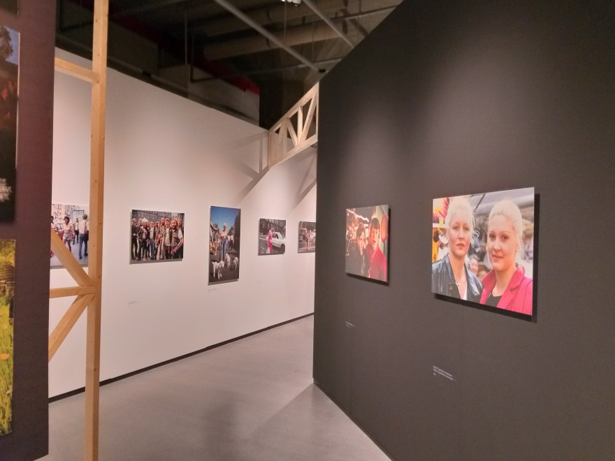
Figure 2- Black and White Walls

3) The use of simply constructed temporary modules to augment fixed wall space and to direct flow (Figs 3-5). Simple, relatively inexpensive, but effective construction that served multiple purposes as display space and traffic director.  Being exposed also provided a contemporary and almost casual feel that suited Ed van der Elksen’s style and subject matter;

LowRes-124719

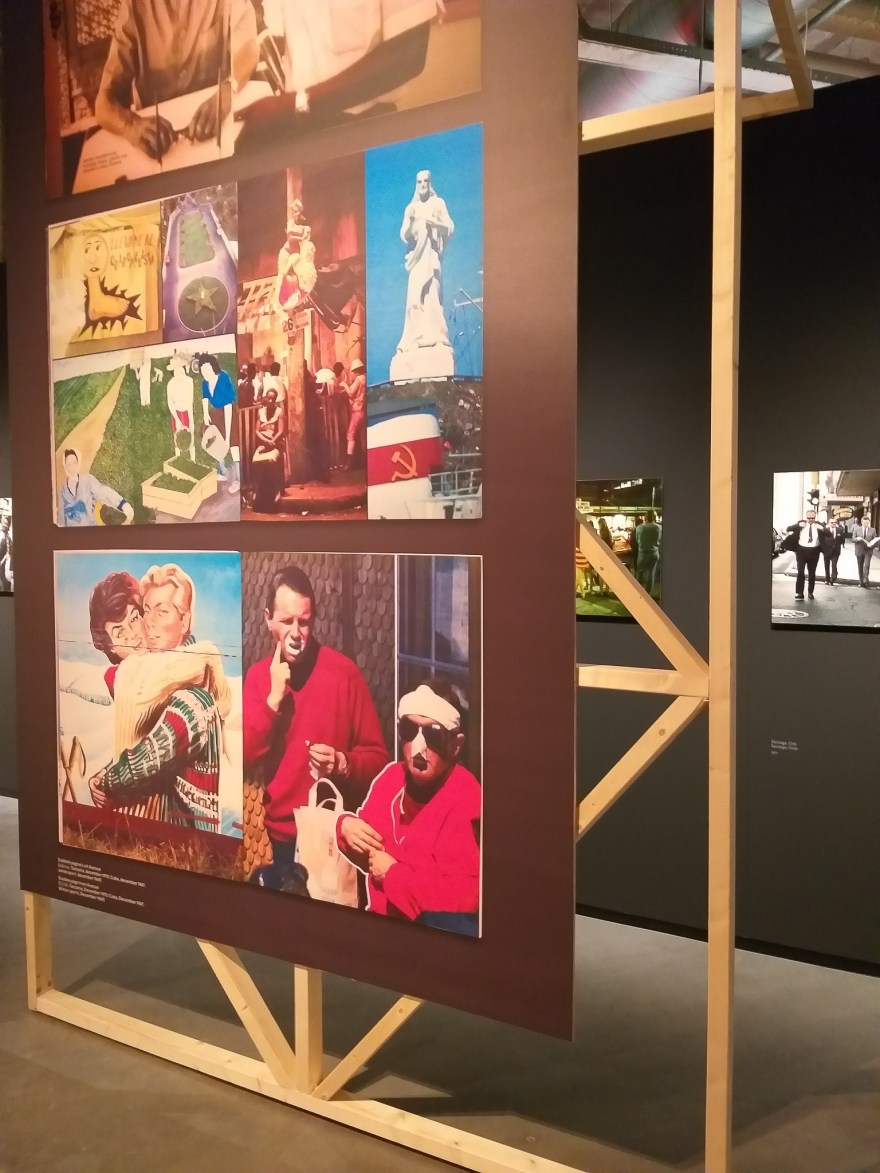
Figure 3- Temporary Walls

LowRes-130501

Figure 4 – Temporary Wall construction

LowRes-130629

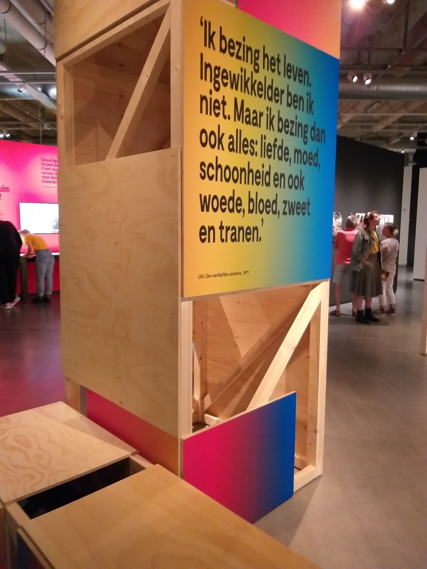
Figure 5 -Temporary construction

4) How effective projected images with either some narration or music were (Fig 6);

LowRes-133454

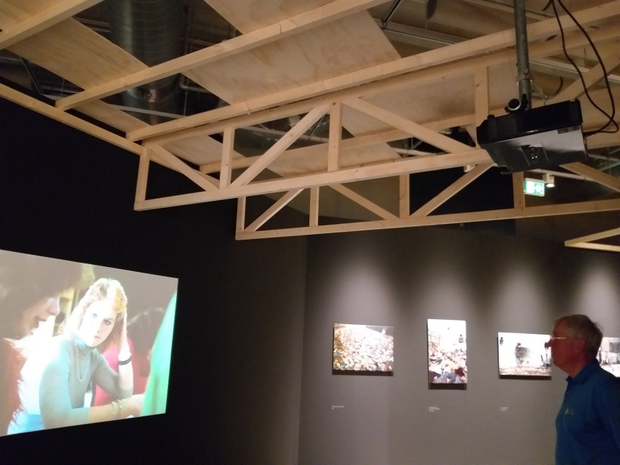
Figure 6 – Projected Images with Temporary Construction

and 5) Perhaps my favourite part of the exhibition was a multi-screen projected  series of images set to music and introduced with text slides at the major transition points presented in a ‘living room’ setting with a mix of sofas and chairs randomly arranged (Fig 7).  Viewers were provided with headsets to listen to the music that accompanied the images and it made the viewing very intimate and personal.

LowRes-134430

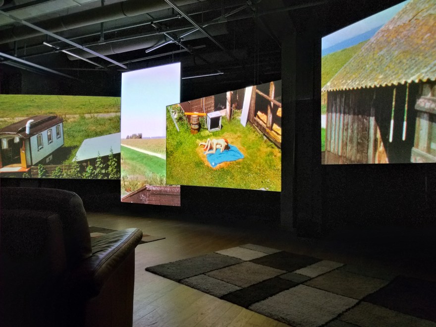
Figure 7 – Multi-Screen projected display

This images projected were in many cases the same as those shown in the main gallery upstairs as individual images on the walls, but I found this to be very engaging and dynamic as the images changed at different times on each of the screens and required the viewers eyes to move quickly between images in contrast to upstairs where one could linger with an image and study it in detail.  While upstairs didn’t promote a narrative and the photos were somewhat randomly arranged in terms of location and time frame, the downstairs projected version was far more narrative and organised in logical segments, topically or chronologically.

I can see this as a very viable approach to exhibiting my work if I can find the appropriate space and solve the technological aspects as it would allow a fast paced, coherent narrative approach while the still image prints in another section would allow the viewer to engage with specific images more fully.

Antwerp was the next stop and I took in several venues while there.  Fotomuseum Antwerp was largely between major exhibitions and was a flurry of activity preparing for 3 openings the following week.  However, the exhibit that was open was on the history of the photobook in Belgium. Figure 8 is an except from the exhibition introduction. It describes the significance of the photobook as a media form as well as the history of the place the photobook has held in Belgian history.

LowResCrop-121911

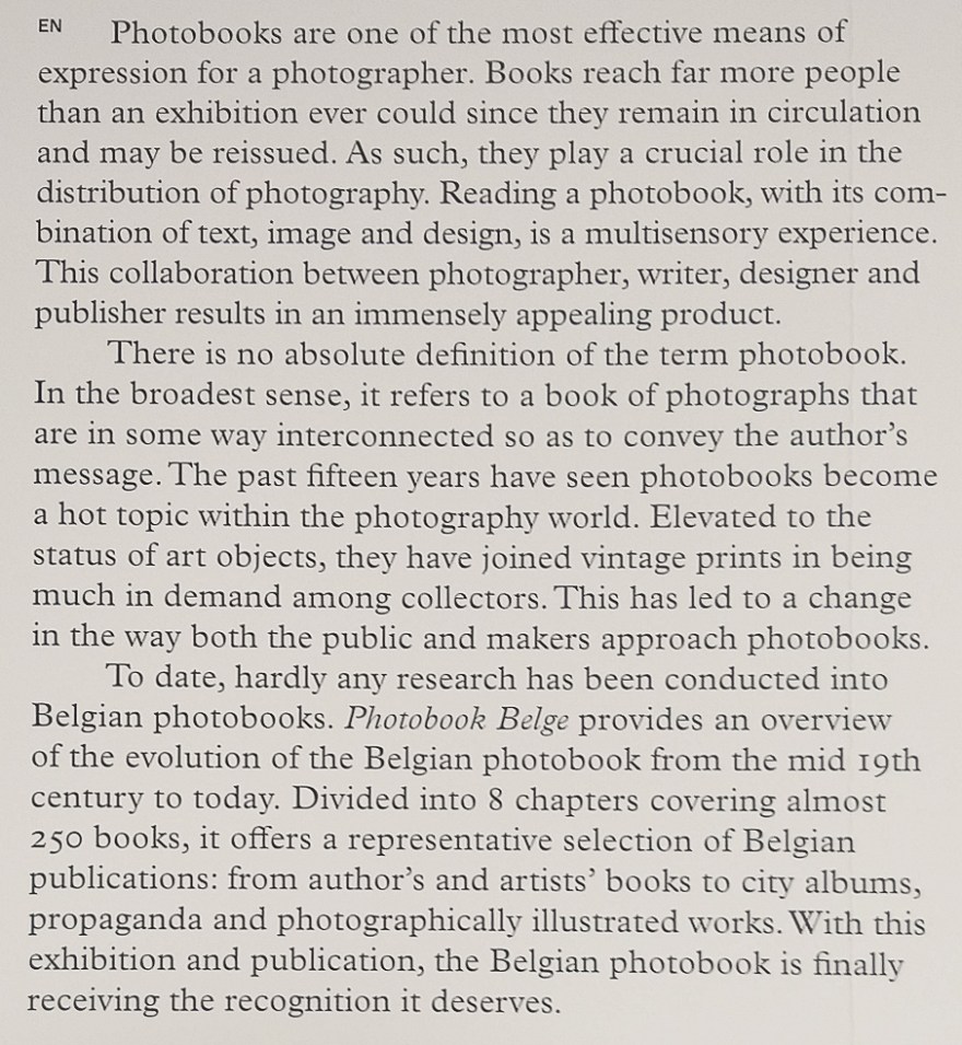
Figure 8 – Photobook Belge Exhibition Introduction

Many of the books were understandably behind glass cases, but the curators used tablet computers with video of the books being turned page by page which I found a clever way of allowing the public to see inside these rare books.  There we also a number of books located throughout the exhibition that were available to the visitor to sit and look through selected books.  A large number of the books on exhibit were created during the colonial period and dealt with the African colonies and their inhabitants.  Many were propaganda and the curators addressed the notion of “colonial gaze” head on in the introduction to that section of the exhibit.

Mounted on one wall were pages from a 1911 book that chronicled a vegetation survey in the various districts of Belgium (Fig 9-10).  I found this interesting and relevant in its similarity to work I have been undertaking, but also in something that I have perhaps been remiss in recording in my work; latitude and longitude information.  That is an omission I intend to correct, particularly since the camera can be set to record that information in the metadata automatically.

LowRes-113805

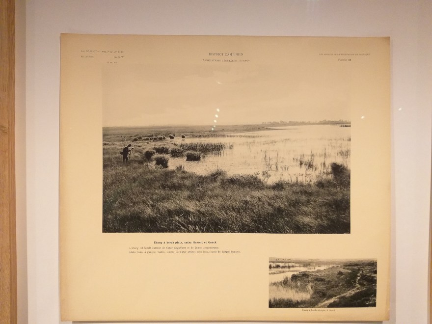
Figure 9 – 1911 Vegetation Survey Plate

LowRes-113746

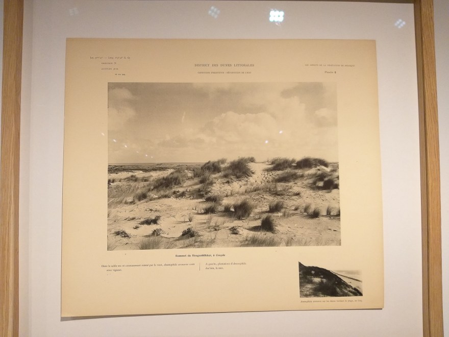
Figure 10 – 1911 Vegetation Survey Plate

The exhibition also touched on the inter-relationship between words and images.  I thought the introduction to this section displayed in Figures 11 and 12 summarised the issue well.

LowRes-113945

Figure 11 – Photobook Belge exhibit section

LowResCrop-113937

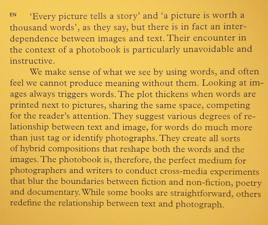
Figure 12 – Detail of above

So while the prints in the Nederlands Fotomuseum exhibition were unframed and uniform in size and placement, the Saul Lieter exhibition at Gallery FIFTY ONE and the exhibits in the Antwerp Museum of Contemporary Art (M HKA) were decidedly different.  While the Lieter photos were all mounted and framed in a similar way, they were not all the same size and they were hung quite differently on different walls.  Some were evenly spaced and set at uniform height, while others were arranged in patterns nearly symmetrical, but not quite (Fig 13).

LowRes-141051

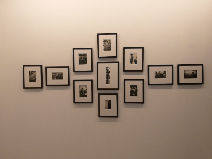
Figure 13- Lieter Exhibition at Gallery FIFTY ONE

I was unable to discern a reason for the arrangement and order in which these photos were hung, but it shows that it is not essential to have symmetry in a hanging plan.  Similarly at M HKA there were exhibits that demonstrated asymmetry, but also there were others that were more traditionally arranged (Figs 14-16).

LowRes-152033

Figure 14 – M HKA asymmetry example 1

LowRes-152024

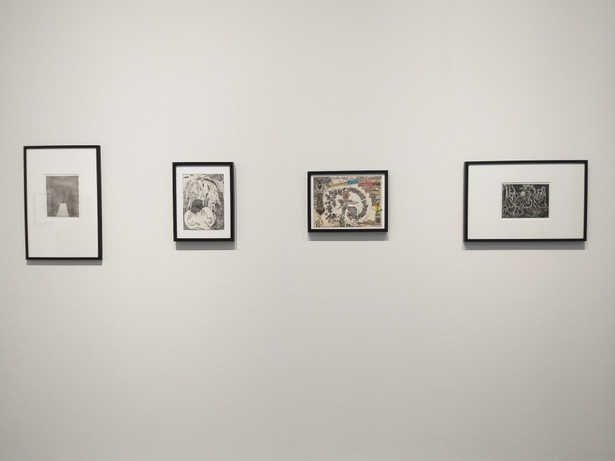
Figure 15 – M HKA asymmetry example 2

LowRes-153726

Figure 16 – M HKA symmetry example 1

As is evident in Figures 14-16 all the photos were mounted and framed in a similar way, however, in other areas, simple thin backing with edge to edge prints were used (Fig 17), and in another area bordered prints were pinned to the wall with no mounting at all (Fig 18).

LowRes-155410

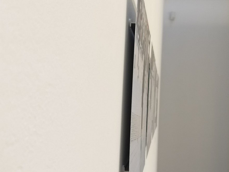
Figure 17 – M HKA thin backing, edge to edge print

LowRes-151741

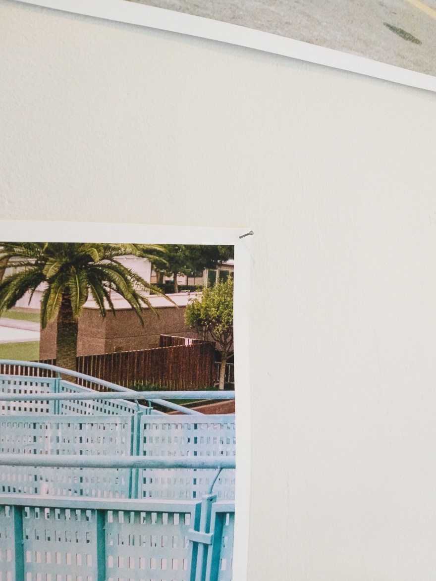
Figure 18 – M HKA pinned print

The final point from M HKA was an installation of newspaper clippings that occupied 4 walls in a large section of the gallery.  The clippings were seemingly each randomly mounted on coloured backing paper and then arranged according to the colour together on one wall (Fig 19).

LowRes-153345LowRes-153336

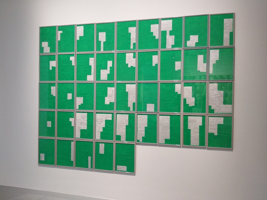
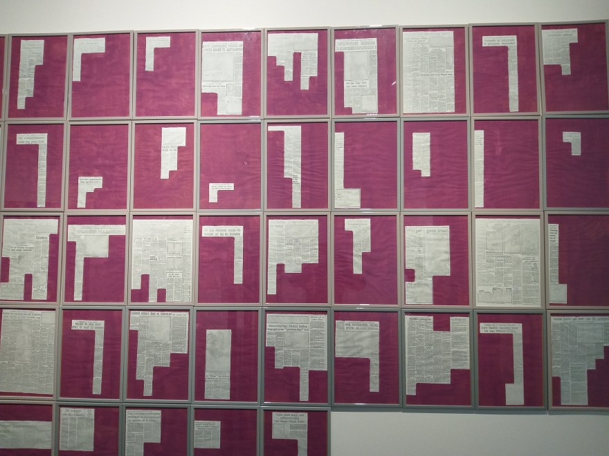
Figure 19 – M HKA Newspaper clippings

As I am considering using references to on-line and print media as part of my exhibition, this was informative.  I don’t believe I would choose to replicate this format, but it was interesting to see how current news was gathered and collated to create an art installation.

In summary, this research provided some valuable insights into the ways exhibitions can be staged and proof that there is no one correct way to stage a successful exhibition.  It also offered some stimulating ideas that I plan to explore further in coming weeks.

Photographer Research – Chrystel Lebas

While Ms. Lebas had been recommended to me earlier on the course and I had looked at her work, I didn’t find it as relevant to what I was doing at the time.  Now, as I move into FMP and the work of prior terms is coming together into a conceptual framework that brings together elements from each of my prior sets of work I find her work especially relevant and directly related to work I am doing.  I am particularly interested in her publications and exhibitions, but also how she has revisited places and used rephotography to show how those landscapes have changed over the intervening years.

Her website is Chrystel Lebas.

I am also interested in how she has incorporated video into her exhibit installations; something I believe is important to mine. Video provides a a perspective and is by its nature immersive, drawing the viewer into scenes they could not otherwise have experienced.

Another interesting element is now that my aesthetic has evolved over the course, I see similarities with much of her work.  When I first looked at it many months ago, I discounted it in part because the aesthetic and way she approached her subject matter was quite different than what I was doing and the way that I was doing it at the time.  Re-examining it now, Lebas’ work bears some commonality with that of Daniel Gustav Cramer with the slightly darker feel that I have evolved to embrace i much of my recent work.  I find it much more evocative and moody, and it encourages the viewer to linger a while in order to really see what is in the photo and feel what is in the scene.

Research – Exhibitions

Over the next week I will be visiting museums and galleries in Rotterdam, Antwerp, Liege and Brussels with an eye toward seeing different ways of exhibiting work that will help to inform the way that I will chose to exhibit my FMP.  I will be looking specifically for effective exhibition strategies, particularly with a series of work that includes a narrative sequence.  I want to see how artists and curators create a visual narrative and to see how much it depends on explanatory or accompanying text, or whether it can also be done without.

As I refine the theme of my FMP and begin to collect the work that will be required, I am also considering how it will be edited, curated and displayed. Among the ideas for my exhibition is a concept published in my FMP proposal and repeated below.

20190620_160330

I look forward to reporting on what I will have seen next week.

FMP Pecha Kucha

The first task for Final Major Project (FMP) was to create a Pecha Kucha presentation (20 slides, 20 seconds per slide) to explain briefly the project I intend to undertake as an introduction for the Module Leader and other students.  I spent much of the interim period since the end of the last module wrestling with how I was going to approach FMP.  The original intent of the Coul Links project was to show how the natural state of the site was affected by development.  Since the development decision is now not expected until late summer at the earliest the FMP project needed to take a different direction.

For more information, please have a look at the following link.